Brand Identity
Kultur | Lx
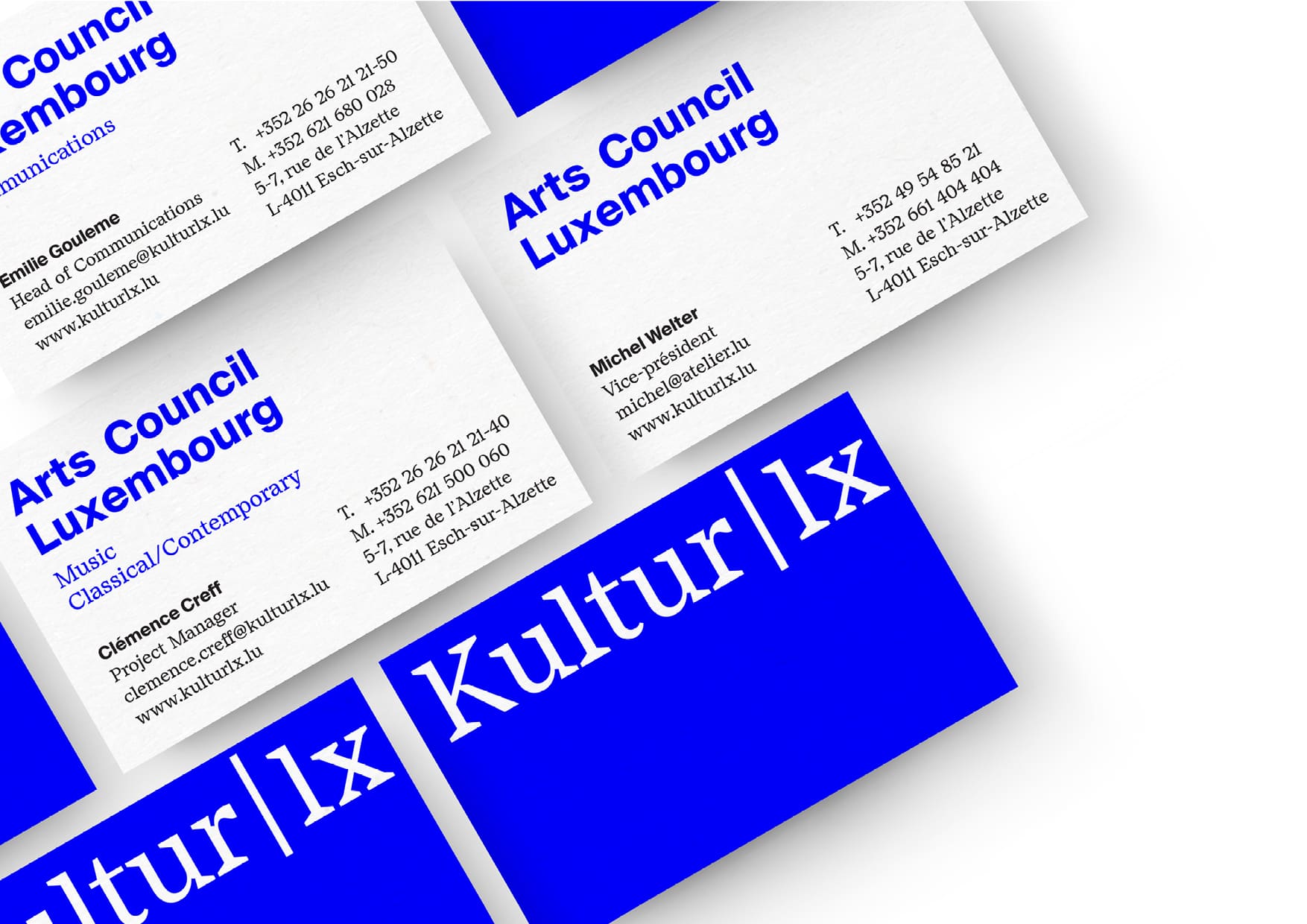
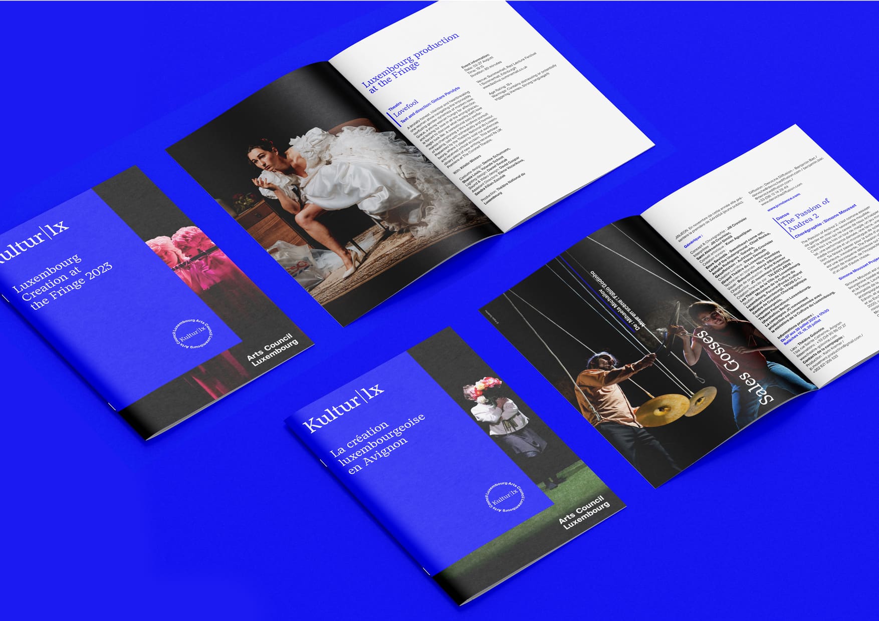
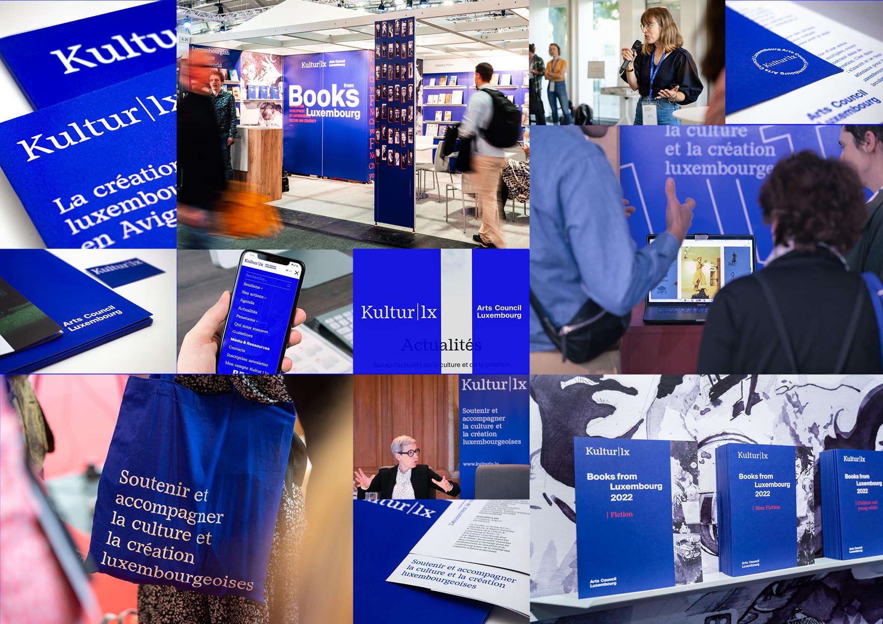
Creating a flexible & strong identity for Kultur | lx - Arts Council Luxembourg, so that Luxembourgish professionals in the cultural sector can communicate at home and abroad with a dynamic, compelling and memorable visual image.
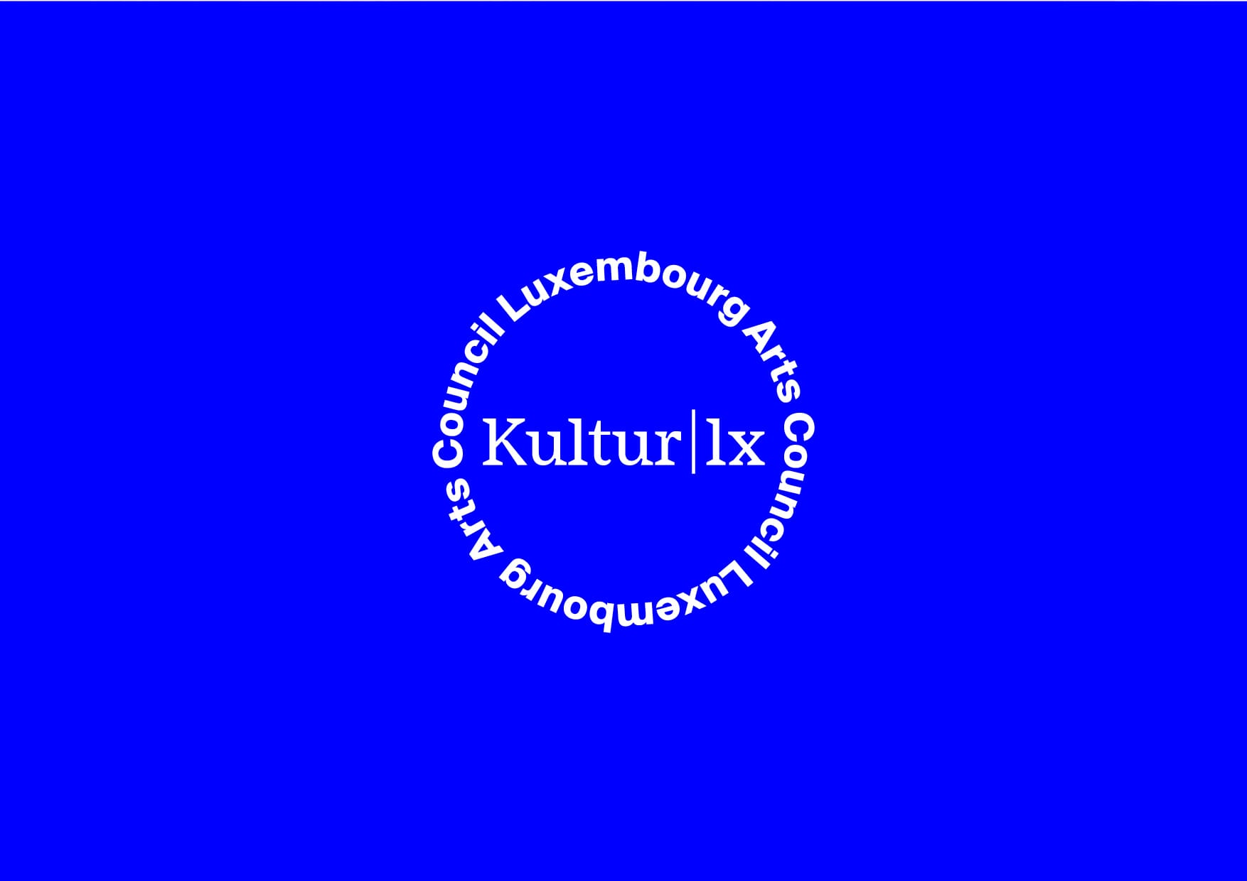
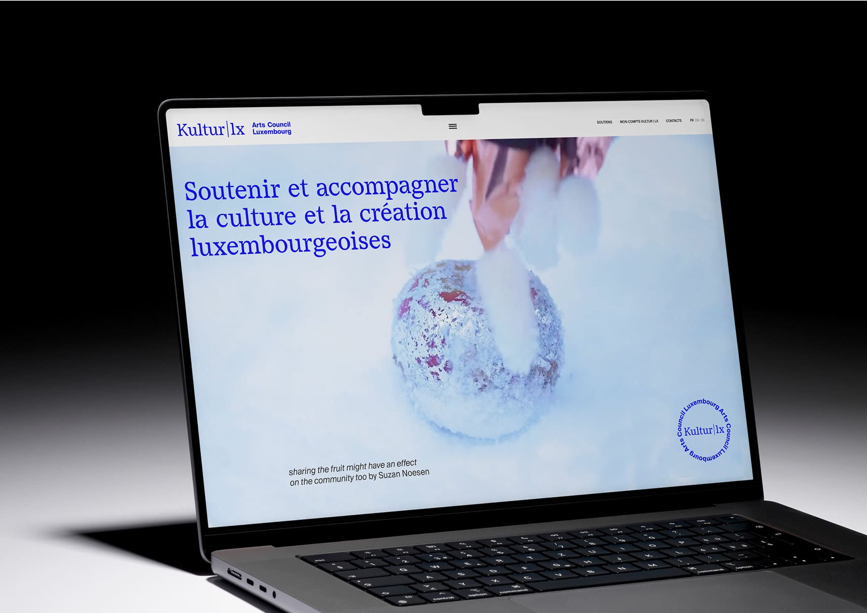
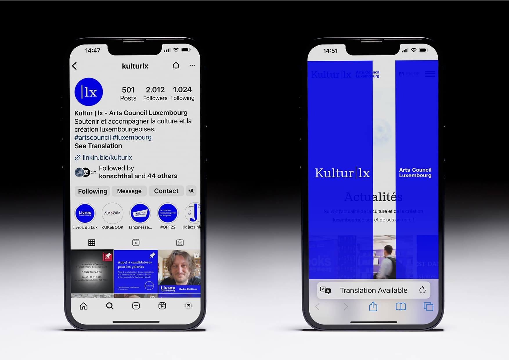
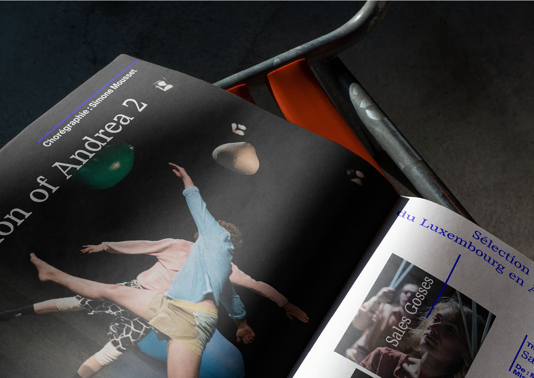
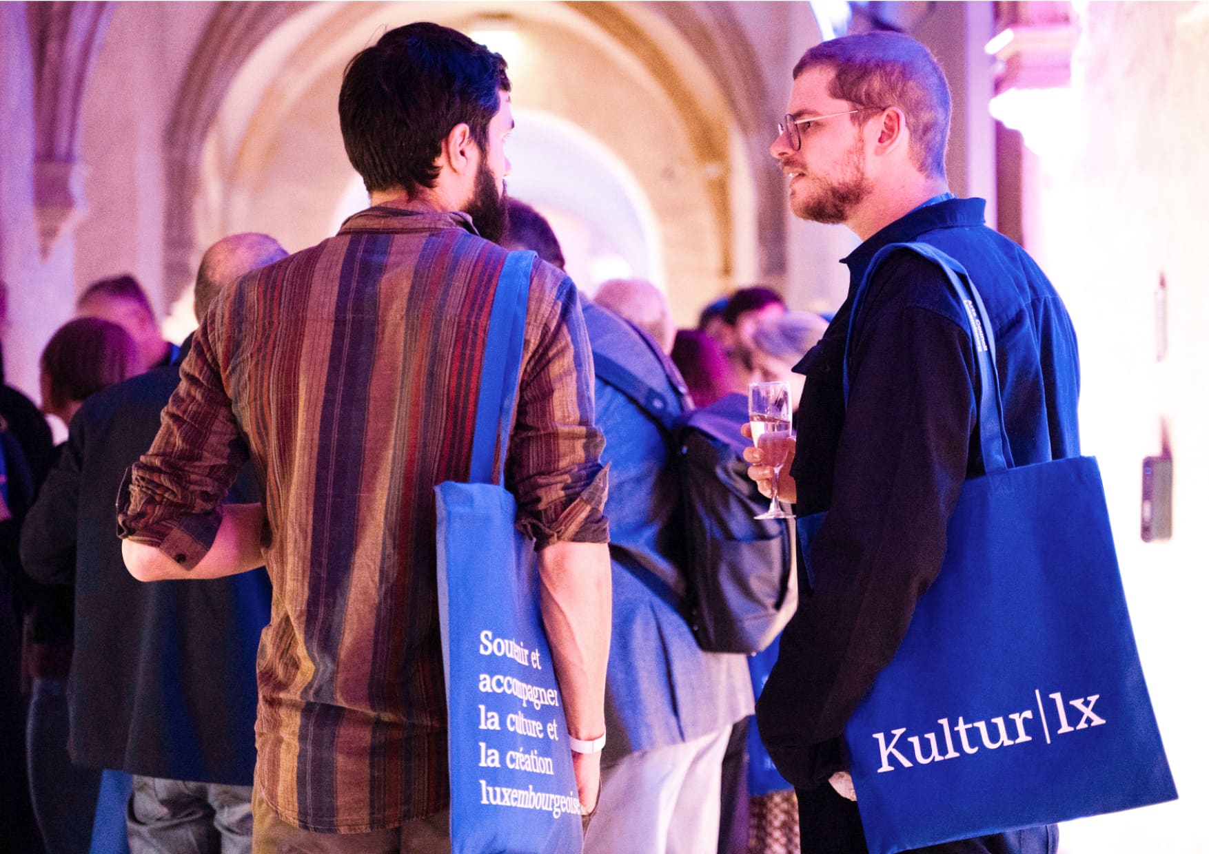
The initial dots between Kultur and lx transform into a vertical line which is used as a graphic element in many brochures and symbolizes an opening curtain on the welcome page of the website. The main wordmark Kultur | lx can be dissociated from Arts Council Luxembourg in communication tools and often appears as a signature at the bottom of print material. An additional tool in the shape of a stamp was created as a playful element. Electric blue was introduced as a main signal colour strengthening the identity’s visibility at trade fairs, press conferences, concerts and other public events. The two typefaces - serif and sans serif - were chosen to give designers more flexibility in their work and to enhance the idea of promoting creativity.
Since its launch in 2021, the identity has been standing out in Luxembourg and abroad and has been adopted by many agencies and designers in Luxembourg to enhance social media communication and print material for professionals in the cultural sector.
This project is a collaboration between MONOGRAM and oxygen
